Thursday, 29 October 2009
Task four,five and six
Front cover
original masthead
main picture
anchoring images
barcode
price
frequancy oof publication
issue number
Date
bold writing
picture is always having eye contact( direct mode of address)
tagline
colourful
Always has a colour scheme
puff
buzzword for example exclusive
image doesn't cover the masthead
mast head in UPPERCASE
contents page:
Picture dominates it.
Set out in columns.
Split into two or three columns.
Normally an editor’s letter.
Have little images to display what they are showing.
There is a page number before the story.
Have a website.
Titles are normally in bold.
Page numbers are a different colour to the stories.
Have contact details and address.
Always have an ‘every week’ column.
Usually two pages.
Line gap between each section.
Subscription details.
Type size 11pt.
Credits for front picture.
Pictures are different sizes and have numbers on them which anchor them to be written in contents.
Regular contents have a page number
the pages are not in order and are normaly in sections for example, Bands
One main picture in some magazines.
Always have bright colours.
Double Page spread:
Drop quotes
small font
lots of writting
one main image
strapline
limited use of colour
short summary at the biggining
first letter is always bigger
head line is always eye catching
artist's name are always big and highlighted
picture of teh journalist
always havea byline ( who wrote it)
txt is in collums
page number
title of article and Magazine.
Task one, two and three
Im am going to do a a alternative music magazine My target aduience will be aged 14-18 mixed gender. This is because the people who buy magazines which are the genre are normaly this age. The music appels to bother boys and girls.
Task Two
Rock sound
price: £3.80
pages -115
published monthly
regulars:
Adverts for differnt gigs
Dear Maria
RSVP
EXPOSURE
Reviews
acrticle on Band
placebo
Features:
differnt band each month
exclusive on tours
brand new
municipal waste
warped tours
Q
Price £3.90
published everymonth
pages : 100
regulars:
Acess all areas
New to Q
soap box
Q hero
My record collection
Cash for Questions
A round with...
q50
Q quiz
last request
Features
Top 50 gigs you must see
greenday
pop babylon
Kerrang
Price:£2.20
Published monthly
pages:71
Regulars:
feedback
News
swag
Live reviews
Features:
Lostphrophets
AFI
motohead
Ozzy Ozbourne
Hatebreed


Task Three
price:£2.80
Published monthly
100 pages
Regualars:
Feedback
gig advertisments
gossip on music
Whos dating who?
Reviews of singles
This month with....
up and coming
Features:
My last lifeline
top 10 gigs
Ultimate Albums you must have
we bring the stars to you....on tour!
50 amazing guitar solo's
We brake down paramores new album for you
Guitar hero or guitar zero?
Monday, 19 October 2009
19th october 2009
Evaluation
I will be evaluating my magazine and contents page. I will be looking at how it both follows and deviates from the codes and conventions of a magazine. I will also talk about how I could have improved my magazine.
My media project both follows and deviates from the codes and conventions of a magazine because if you look at my front cover you will see that I have a big mast head, this is so it will stand out and my target audience will see it more clearly. I followed them a lot on my magazine front cover as you can see, as I have my positioning statement, date and issue number at the top by my title and my bar code at the bottom. This is what the codes and conventions say, I followed them so my target audience will see them and recognise straight away that it’s a magazine from the setting. I also challenged the codes and conventions as my contents page is only one page whereas most contents pages are two page spreads. I decided to change this because i know from experience that no one really looks at the contents page for long, and my target audience won't want too many pages of a contents page. I chose to do this so it will appeal to my target audience more.
To make my magazine and contents page I used Photoshop and QuarkXPress. I used Photoshop on the front page and Quark on the contents page. I found Quark easier to use than Photoshop as I found the tools where easier to find and I thought it was easier to play around with. I thought using these technologies made making my project easier as I could play around with the colours and pictures more but also if I accidently locked the layers I could no longer change what I wanted to or if something when wrong with the system then I could not save it or access my work.
If you look at my sketches you will see that I have changed my project from the original idea because once I had uploaded it onto the computer I thought that it was not as effective so I changed it and it worked so that’s why they are different. Overall I am happy with my project as I think I worked well and hard on it, if I would improve anything I would change the colours so they stand out more and I would put more coverlines on my front cover other than that I am happy with my production.
Friday, 16 October 2009
Thursday, 15 October 2009
My media planning
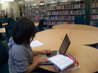
I also come up with a few ideas of where my mis-en-scene will be:
By the main office: this was because it shows that its in a shcool and thats where the trophys are kept to show the school achieves.
I could use the library because it shows that it is academic, and the schools sudents try and work hard
i might also use the library because it science is a subject people associate this subject well cleverness and succsess.
Coverlines
Features:
Cyber freaks:i choose this because recently everyone is more preoccupied with the computer than books so people would be interested
New students settle in: its the start of term, so in every school there are new students, so everyone could relate
Demi meets Demi: This will appeal to my audience because its like someone they know and someone famous with the same name so its its catchy too!
Smile Smile Smile: its international smile day so this would be appropriate
Aliens invade the science lab: Most people will find this interesting beause Aliens are everywhere, in films,books and t.v
Ice radio goes live........Again: The schools radio station will go back on air, people will find it interesting because it concerns them, THEIR radio station.
outstanding by offstead: the target audiences School is outstanding the teachers, and the young ones will find this feature interesting
1 in 10 girls feel fab: Premotes body health.
Who you gonna call? BULLY BUSTERS: This is normaly the age in which people are bullied so i put this in so people could read it and learn how to stop being bullied to stop bein a victim.
Regulars:
Film Fest,Music Mad,Game on or Game over, Mirror Mirror on the wall who's the hottest of them all, and book worm: These are all reviews in the media as people will want to know the latest gossip, whats good in music, books and films as this is what the target audience want to know so it will make more enjoyable toread.
Dear Donna:So the target audience can ask for advice and feel as though they have somewhere to go, the shool magazine
Damynt Words: A welcome letter and i chose to put this in because
Achievment wall,Mail Bag,Shame Stories: This is so the Target audeince can have there say, and have an oppion and be involbed
Friday, 9 October 2009
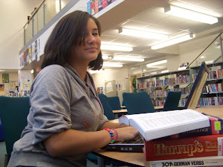
main image

after looking at all my pictures, i decied to choose this one
i choose this because it has a direct mode of address and it signifies that she prefares the computer rather than books....this is because my coverstory will be cyber freaks.
I have chosen to minipulate this image by fliping this picture horozontal. This was becuase i thought it looked better the oposite way and i could fit more on the front cover. Here if the picture after i minipulated it

9th of october
I wanted a colour that stood out against the bac ground and so you could see it when it was on a shelf.


