1. In what ways does your media product use, develop or challenge codes and conventions of real media product?

The picture above is my product and the picture next to it, is a magazine of the same genre, by looking and comparing these images you can see the similarities. My masthead is big, and you can see straight away that this is the name of the Magazine. The main images also have direct mode of address. You can clearly see that my issue number and date are shown on the front cover. In my media product you can see there is a white shadow on the anchoring text, this can be said to challenge the codes and conventions because the majority of magazines don’t have this, as some think it distracts the eye to much. I decided to include this so you can see the text against the background chosen, it also makes it stand out a lot more. . They both have dark eyes, which is a common make up trend for the target audience.

As you can see from the pictures, you can see both main images go over the title. I challenged the codes and conventions because I originally had a blocked off section where my mast head is, like Kerrang has a white background.


 2. How does your media product represent particular social groups?
 My media represents the alternative ‘indie group’. You can see this by the big hair; my social group are known for this type of hair. They are different; ‘individual’ and they stand out in crowds. I represented this by having a really stand out image, so it draws attention to it. The colours I used, I generally associated with the serotype of this group. If you follow the link below you will see a video of people of whom I tried to attract with my magazine.
http://www.youtube.com/watch?v=izKixy1FO1Q
http://www.youtube.com/watch?v=N9cu_jcMMHc
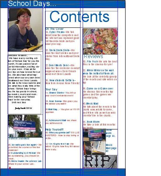
 I choose these colours because they compliment each other and stand out to my target audience

3. What kind of media institute might distribute your media product and why?I would use the company IPC media as it produces a wide range of genres including music. NME is an example. IPC media is one of the UK’s leading publishers selling 350 million copies a year. They publish different genres. This will help my product sell more. More information is on the website. ( http://www.ipcmedia.com/ ). I would use this company because NME is one the UK’s best selling music magazines, it is also very specific magazine as it concentrates on bands, it does include news of the music but it is very specific to bands. This is like my product as mine is a music magazine about specific things in music such as Gigs; it includes other things, like new music news but focus’s on one thing. If I had to choose another institute I would choose Bauer Media as they produce magazines such as Q Kerrang! And Mojo, which are all music magazines in the same or similar genres to mine.www.bauermedia.co.uk
 4. Who would be the audience for the media product?
Below is a profile of the target audience.
 Name
Name: Dougie
Age: 16
Occupation: Student
Hobbies: Listens to Ipod
drummer in indie group
going to Gigs
Hanging out with friends
Face book group
This profile is the ideal consumer, as he is interested in the things the magazine has to offer. It’s a typical teenager who is simply in love with music, and many of them are, so this magazine would be great for them. It includes all the things the a consumer likes.
5. How did you attract/address your audience?I attracted the audience by using colours that would attract my audience, by using the colours that are more than often associated with this group it stands out. I also used a big stand out picture, and features that would appeal to them. If you look at this video you will see that by using the colours, it attracted my target audience. My main image was used to attract my audience because I went by how they looked.
I learnt how to use Quarkxpress whilst making my product; I became more familiar with photoshop also from these photos you can see me working on these programs. I also have videos; if you watch these
videos you will see me showing how to use a certain tool, as well as what I found useful.


 Photoshop-
I used photo shop to make my front cover as well as adding effects to different photos.
Music magazines- I used this for research to get my magazine as close as possible, I mainly used Rock sound, and Kerrang.
Computer- I used a computer to edit my work, as the software was on the computer plus it made it easier to edit.
Mobile Phone- I used this technology because it was easy to access and I could have it handy anytime necessary. I used it to film videos as well as take a few photos.
Quark Xpress- I used Quark to edit my double page spread, and contents because it was easier to edit a two page. It is also used in the industry.
Internet- This was because it was easy to access. I used it for research purposes, such as codes and conventions, target audience, magazines. I also used the internet to log my progress on my bog.
Camera- I used the camera to take photos, for my main image, and supporting images and all three products.
7. Looking back at your preliminary task, what do you feel you have learnt in the progression from it to the full product?I asked various people to compare both my preliminary task, and my product, by watching these videos below you can see there reaction. I think my media product is better because I was used to the technology more, which made it easier to play around with the tools and add more to the appearance.


 My final production peice


 I choose these colours because they compliment each other and stand out to my target audience
 4. Who would be the audience for the media product?
 Name: Dougie


